The global rethinking of the identity took place for the first time in 12 years. We worked on the design update together with Bulanov Buro.
WARTO Communications Agency has been operating in the Ukrainian marketing and PR market since 2005. Over these 17 years, the agency’s history has seen many events: changes in the team, moving to different offices, launching new services and products for brands. Together with its clients, the agency has gone through all the challenges and crises: The global economic crisis, the Revolution of Dignity and the beginning of the Russian-Ukrainian war in 2014, the pandemic and Russia’s full-scale invasion of Ukraine. Design has remained the only constant component, but it’s time to rethink it as well.
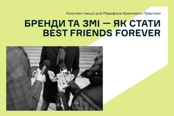
“Disarming” the logo
The agency’s previous logo, a combination of a brain and a grenade, was designed in 2010 by Roman Shostya, a design partner of the WARTO team.

– Usually, when new people saw our logo on business cards during introductions, their reaction was: “Brain explosion! Wow!”. And for clients, this logo was associated with an explosion of creative ideas and solutions offered by our team. When this logo was first created, we deliberately laid down such combat, dynamic meanings. At the same time, this familiar symbol has now acquired a painful meaning and is associated not with an explosion of creativity, but with the trauma that all Ukrainians are experiencing. This became one of the main motives for changing the identity. We also intensified our work on international partnerships and decided that we should represent our country without grenades and explosions, that the word “WARTO” – authentic, Ukrainian, meaningful – deserves to be an independent symbol that we will promote outside Ukraine, telling foreign partners about its meaning and value for us,” said Natalia Kholod, founder and CEO of the WARTO agency.
– We supported the idea of the agency’s team and shifted the emphasis to the word “WARTO” – it is both the name of the agency and a call: it is worth working, worth creating, worth being creative. Thus, the agency received a new, fully typographic logo. The agency’s team developed it together with a professional type designer Kirill Tkachev. “The logo may look simple, but only at first glance: it is very precise, restrained, expressive, there is nothing superfluous in it, but it will definitely be remembered for its conciseness and sonority,” explained Dmitry Bulanov, design director of Bulanov büro.
New identity and its components
Bulanov büro has developed a design system and a guideline for WARTO agency that will allow to effectively use all the proposed solutions. In particular, the logo was complemented by a bright color scheme designed to dilute the seriousness and minimalism of the font solution and add accents.

– Usually, when new people saw our logo on business cards during introductions, their reaction was: “Brain explosion! Wow!”. And for clients, this logo was associated with an explosion of creative ideas and solutions offered by our team. When this logo was first created, we deliberately laid down such combat, dynamic meanings. At the same time, this familiar symbol has now acquired
– The identity, from the logo to the color scheme and accompanying graphics, combines two moods: strength, analytical, expressive – as the agency’s expertise, its many years of experience, strong professional background, and humanity, lively emotions, creativity – as a symbol of the agency’s dynamic team and their creative ideas. It is a mix of business and human components,” said Dmytro Bulanov.
The team chose simplicity, purity and self-sufficiency of design as the main principles for creating a new identity. Therefore, simple geometric shapes were used in the main graphics: rectangle, triangle, square, circle – symbols of fundamentality and stability. The proposed solutions create space for scaling the design system and different approaches to the use of elements. According to the designers, this solution will remain relevant even over time.